
This topic explains the method to identify the distribution of a continuous variable using the histogram.
Data ingestion
Python library is a collection of functions and methods that allows you to perform many actions without writing your code. To make use of the functions in a module, you’ll need to import the module with an import statement.
import numpy as np
import scipy.stats
import pandas as pd
import matplotlib
import matplotlib.pyplot as plt
%matplotlib inline
data = pd.read_csv('petroleum.csv')
Download the petroleum.zip
data.info()
result:
<class 'pandas.core.frame.DataFrame'>
RangeIndex: 216 entries, 0 to 215
Data columns (total 5 columns):
Year             216 non-null int64
Geography        216 non-null object
Import           216 non-null float64
Export           216 non-null float64
CO2 Emissions    216 non-null float64
dtypes: float64(3), int64(1), object(1)
memory usage: 8.5+ KB
data.head(4)
result:
| Year | Geography | Import | Export | CO2 Emissions | |
|---|---|---|---|---|---|
| 0 | 1980 | Africa | 618.184 | 5428.078 | 525.605046 |
| 1 | 1981 | Africa | 609.270 | 3964.097 | 519.408287 |
| 2 | 1982 | Africa | 557.209 | 3458.547 | 558.221545 |
| 3 | 1983 | Africa | 477.787 | 3394.148 | 586.002081 |
Histogram
A histogram is an accurate representation of the distribution of numerical data.
plt.figure(figsize=(20,5))
plt.subplot(1,2,1);
data.Import.plot(kind='hist',histtype='step',bins=50)
plt.axvline(data.Import.mean(),c='red',label = 'Mean')
plt.axvline(data.Import.median(),c='green',linestyle='--',label = 'Median')
plt.axvline(data.Import.quantile(0.25),c='blue',linestyle=':',label = '0.25 quantile')
plt.axvline(data.Import.quantile(0.75),c='blue',linestyle=':',label = '0.75 quantile')
plt.axis(xmin=-100,xmax=25000)
plt.title('Petroleum Import',fontweight="bold",fontsize = 20)
plt.xlabel('barrels per day',fontweight="bold",fontsize = 15)
plt.ylabel('Frequency',fontweight="bold",fontsize = 15)
plt.xticks(fontweight="bold",fontsize = 10)
plt.yticks(fontweight="bold",fontsize = 10)
plt.legend(loc=1, prop={'size': 15})
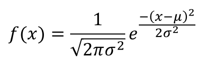
plt.subplot(1,2,2);
data.Export.plot(kind='hist',histtype='step',bins=50)
plt.axvline(data.Export.mean(),c='red',label = 'Mean')
plt.axvline(data.Export.median(),c='green',linestyle='--',label = 'Median')
plt.axvline(data.Export.quantile(0.25),c='blue',linestyle=':',label = '0.25 quantile')
plt.axvline(data.Export.quantile(0.75),c='blue',linestyle=':',label = '0.75 quantile')
plt.axis(xmin=-100,xmax=25000)
plt.title('Petroleum Export',fontweight="bold",fontsize = 20)
plt.xlabel('barrels per day',fontweight="bold",fontsize = 15)
plt.ylabel('Frequency',fontweight="bold",fontsize = 15)
plt.xticks(fontweight="bold",fontsize = 10)
plt.yticks(fontweight="bold",fontsize = 10)
plt.legend(loc=1, prop={'size': 15})
plt.subplots_adjust(wspace=0.5)
plt.show()
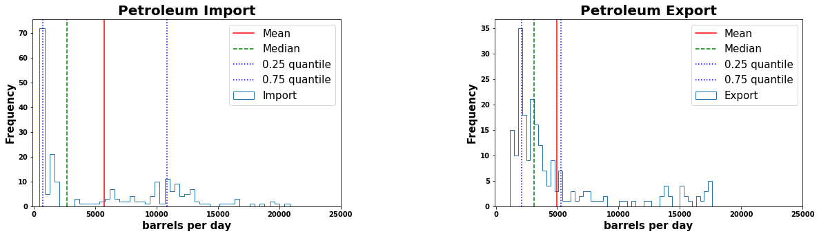
The above distribution comparision shows that the most of the export data is around 2100 and 5300 barrels per day. The most of the petroleum import is around 750 and 11000 barrels per day. But as per the calculated median from the above two distributions, the import data is more positively skewed due to outliers compared to export data.
Probability density function:
- Representing the distribution for a continous variable
- Probability of a particular outcome is always zero
- The probability density function is nonnegative everywhere
- The integral over the entire space or area under the curve is equal to one.
# Probability density curve

plt.figure(figsize=(10,5))
data.Export.plot(kind='hist',histtype='step',bins=30,density=True)
data.Export.plot.density(bw_method=.09)
plt.axis(xmin=-0,xmax=20000)
plt.title("Probability density curve",fontweight="bold",fontsize=20)
plt.xlabel('barrels per day',fontweight="bold",fontsize = 15)
plt.ylabel('Density',fontweight="bold",fontsize = 15)
plt.xticks(fontweight="bold",fontsize = 10)
plt.yticks(fontweight="bold",fontsize = 10)
plt.legend(loc=1, prop={'size': 15})
plt.show()
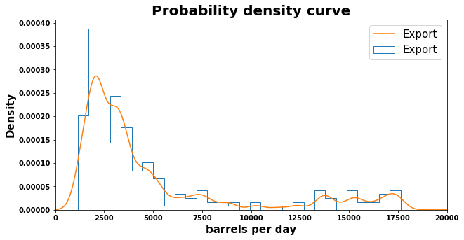
The above distribution is positive skewed. A distribution is positively skewed if the scores fall toward the lower side of the scale and there are very few higher scores. Positively skewed data is also referred to as skewed to the right because that is the direction of the ‘long tail end’ of the chart.
References :
- https://www.eia.gov/
- https://stackoverflow.com/
Comments