
This topic explains the basics of a box plot and to detect the outliers of the given data visually using box plot.
Data ingestion
Python library is a collection of functions and methods that allows you to perform many actions without writing your code. To make use of the functions in a module, you’ll need to import the module with an import statement
import numpy as np # for multi-dimensional arrays and matrices operations
import scipy.stats # for scientific computing and technical computing
import pandas as pd # data manipulation and analysis
import seaborn as sns # Python's Statistical Data Visualization Library
import matplotlib # for plotting
import matplotlib.pyplot as plt
Matplotlib is a magic function in IPython.Matplotlib inline sets the backend of matplotlib to the ‘inline’ backend. With this backend, the output of plotting commands is displayed inline within frontends like the Jupyter notebook, directly below the code cell that produced it.
%matplotlib inline
# Read the csv file using pandas
data = pd.read_csv('petroleum.csv')
Download the petroleum.csv
# Display the basic table information
data.info()
result:
<class 'pandas.core.frame.DataFrame'>
RangeIndex: 216 entries, 0 to 215
Data columns (total 5 columns):
Year             216 non-null int64
Geography        216 non-null object
Import           216 non-null float64
Export           216 non-null float64
CO2 Emissions    216 non-null float64
dtypes: float64(3), int64(1), object(1)
memory usage: 8.5+ KB
# Display first 5 rows as a table
data.head(5)
result:
| Year | Geography | Import | Export | CO2 Emissions | |
|---|---|---|---|---|---|
| 0 | 1980 | Africa | 618.184 | 5428.078 | 525.605046 |
| 1 | 1981 | Africa | 609.270 | 3964.097 | 519.408287 |
| 2 | 1982 | Africa | 557.209 | 3458.547 | 558.221545 |
| 3 | 1983 | Africa | 477.787 | 3394.148 | 586.002081 |
| 4 | 1984 | Africa | 507.619 | 3629.964 | 612.150112 |
# Describe statistics summary of a feature or variable

data[data.Geography == 'Asia'].Import.describe()
result:
count       36.000000
mean     11928.644624
std       4830.261052
min       5710.417000
25%       7001.003250
50%      11717.250500
75%      16120.587750
max      20838.615000
Name: Import, dtype: float64
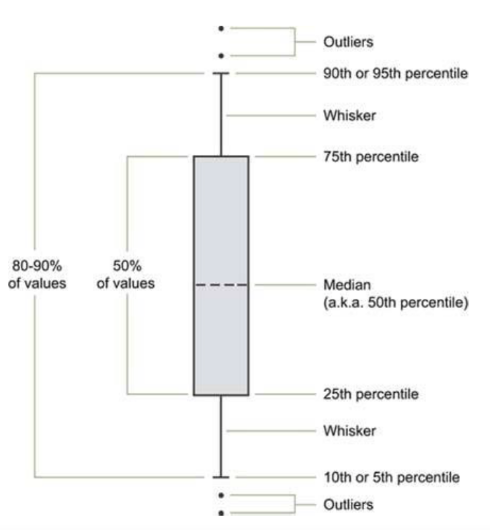
The box plot (a.k.a. box and whisker diagram) is a standardized way of displaying the distribution of data based on the five number summary:
- Minimum
- First quartile
- Median
- Third quartile
- Maximum
When reviewing a boxplot, an outlier is defined as a data point that is located outside the fences (“whiskers”) of the boxplot. (e.g: outside 1.5 times the interquartile range above the upper quartile and bellow the lower quartile)
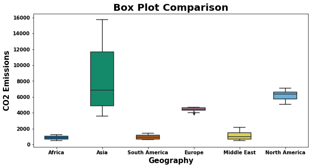
# Plot box plot to find out the outliers using a single feature or variable

plt.figure(figsize=(10,5))
sns.boxplot(x = 'Geography', y = 'CO2 Emissions', data=data,
                 width=0.5,
                 palette="colorblind")
plt.title('Box Plot Comparison',fontweight="bold",fontsize = 20)
plt.xlabel('Geography', fontweight="bold",fontsize=15)
plt.ylabel('CO2 Emissions', fontweight="bold",fontsize=15)
plt.xticks(fontweight="bold",fontsize = 10)
plt.yticks(fontweight="bold",fontsize = 10)
plt.show()
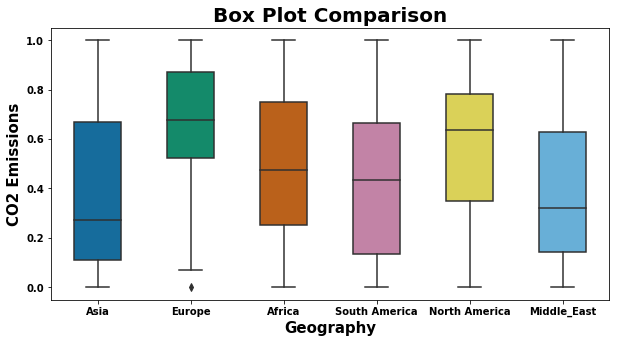
data.rename(columns={'CO2 Emissions':'CO2_Emissions'}, inplace=True)
Asia_emissions = data[data.Geography == 'Asia'].CO2_Emissions
Europe_emissions = data[data.Geography == 'Europe'].CO2_Emissions
Africa_emissions = data[data.Geography == 'Africa'].CO2_Emissions
South_America_emissions = data[data.Geography == 'South America'].CO2_Emissions
North_America_emissions = data[data.Geography == 'North America'].CO2_Emissions
Middle_East_emissions = data[data.Geography == 'Middle East'].CO2_Emissions
Data Normalization
- Tranforms the data in the range between 0 to 1.
- Make the data consistent so that helps to compare the different data in a same scale format
def normalization(data):
    data -= np.min(data, axis=0)
    data /= np.ptp(data, axis=0)
    return data
Asia_emissions = normalization(Asia_emissions)
Europe_emissions = normalization(Europe_emissions)
Africa_emissions = normalization(Africa_emissions)
South_America_emissions = normalization(South_America_emissions)
North_America_emissions = normalization(North_America_emissions)
Middle_East_emissions = normalization(Middle_East_emissions)
data_boxplot = pd.DataFrame({'Asia': Asia_emissions, 'Europe': Europe_emissions, 'Africa' : Africa_emissions, 'South America': South_America_emissions, 'North America': North_America_emissions, 'Middle_East': Middle_East_emissions})
plt.figure(figsize=(10,5))
sns.boxplot(data=data_boxplot,
                 width=0.5,
                 palette="colorblind")
plt.title('Box Plot Comparison',fontweight="bold",fontsize = 20)
plt.xlabel('Geography', fontweight="bold",fontsize=15)
plt.ylabel('CO2 Emissions', fontweight="bold",fontsize=15)
plt.xticks(fontweight="bold",fontsize = 10)
plt.yticks(fontweight="bold",fontsize = 10)
plt.show()
References :
https://www.eia.gov/
Comments