
This topic explains the basics and advanced scatter plots using python and its libraries.
Data ingestion
Python library is a collection of functions and methods that allows you to perform many actions without writing your code. To make use of the functions in a module, you’ll need to import the module with an import statement
import numpy as np # for multi-dimensional arrays and matrices operations
from scipy import stats # for scientific computing and technical computing
import pandas as pd # data manipulation and analysis
import matplotlib # for plotting
import matplotlib.pyplot as plt
import seaborn as sns # visualization library
Python libraries for interactive plots
from ipywidgets import interact, widgets # for interactive plotting
from IPython.display import Image # for display the image
import matplotlib.patches as mpatches # for creating the plotting legends
Matplotlib is a magic function in IPython.Matplotlib inline sets the backend of matplotlib to the ‘inline’ backend. With this backend, the output of plotting commands is displayed inline within frontends like the Jupyter notebook, directly below the code cell that produced it.
%matplotlib inline
# Read the csv file using pandas
data = pd.read_csv('petroleum.csv')
Download the petroleum.zip
Display the basic table information
# Display the basic table information
data.info()
result:
<class 'pandas.core.frame.DataFrame'>
RangeIndex: 216 entries, 0 to 215
Data columns (total 5 columns):
Year             216 non-null int64
Geography        216 non-null object
Import           216 non-null float64
Export           216 non-null float64
CO2 Emissions    216 non-null float64
dtypes: float64(3), int64(1), object(1)
memory usage: 8.5+ KB
# Display first 5 rows as a table
data.head(5)
result:
| Year | Geography | Import | Export | CO2 Emissions | |
|---|---|---|---|---|---|
| 0 | 1980 | Africa | 618.184 | 5428.078 | 525.605046 |
| 1 | 1981 | Africa | 609.270 | 3964.097 | 519.408287 |
| 2 | 1982 | Africa | 557.209 | 3458.547 | 558.221545 |
| 3 | 1983 | Africa | 477.787 | 3394.148 | 586.002081 |
| 4 | 1984 | Africa | 507.619 | 3629.964 | 612.150112 |
Basic scatter Plot
A Scatter (XY) Plot has points that show the relationship between two sets of data. It show how much one variable is affected by another. The relationship between two variables is called their correlation .
# Basic scatter Plot

plt.figure(figsize=(10,10))
data[data.Geography == 'Asia'].plot.scatter('Import','CO2 Emissions',c = 'red')
plt.xlabel('Petroleum import', fontweight="bold",fontsize=15)
plt.ylabel('CO2 Emissions', fontweight="bold",fontsize=15)
plt.title('scatter Plot',fontweight="bold",fontsize = 20)
plt.xticks(fontweight="bold",fontsize = 10)
plt.yticks(fontweight="bold",fontsize = 10)
plt.show()
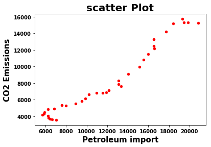
Calculate a Pearson correlation coefficient and the p-value for testing non-correlation. The Pearson correlation coefficient measures the linear relationship between two datasets. Correlations of -1 or +1 imply an exact linear relationship. Positive correlations imply that as x increases, so does y. Negative correlations imply that as x increases, y decreases. The p-value roughly indicates the probability of an uncorrelated system.
stats.pearsonr(data['Import'],data['CO2 Emissions'])
result :
(0.8928206682882276, 4.545130853682412e-76)
The above result shows that the relationship between them are positively correlated and statistically significant due to low p value.
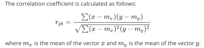
Bubble Scatter Plot
A bubble chart is a variation of a scatter chart in which the data points are replaced with bubbles, and an additional dimension of the data is represented in the size of the bubbles.
def plotyear(year):
    bubble = data[data.Year == year].sort_values('Import',ascending=False)
    area = 1 * bubble.Import
    color = bubble.Export
    edgecolor = bubble.Geography.map({'Africa': 'skyblue','Europe': 'gold','North America': 'palegreen','Asia': 'coral','South America': 'darkgreen','Middle East': 'violet'})

    bubble.plot.scatter('Import','CO2 Emissions',logx=True, vmin=55, vmax=100,
                      s=area, c=color,
                      colormap=matplotlib.cm.get_cmap('Reds_r'),
                      linewidths=1, edgecolors=edgecolor,sharex=False,
                      figsize=(10,6.5))

    plt.axis(xmin=100,xmax=50000,ymin=-2000,ymax=10000)
    plt.xlabel('Petroleum Import', fontweight="bold",fontsize=15)
    plt.ylabel('CO2 Emissions', fontweight="bold",fontsize=15)
    plt.xticks(fontweight="bold",fontsize = 10)
    plt.yticks(fontweight="bold",fontsize = 10)
    plt.title('scatter Plot',fontweight="bold",fontsize = 20)

plotyear(1980)
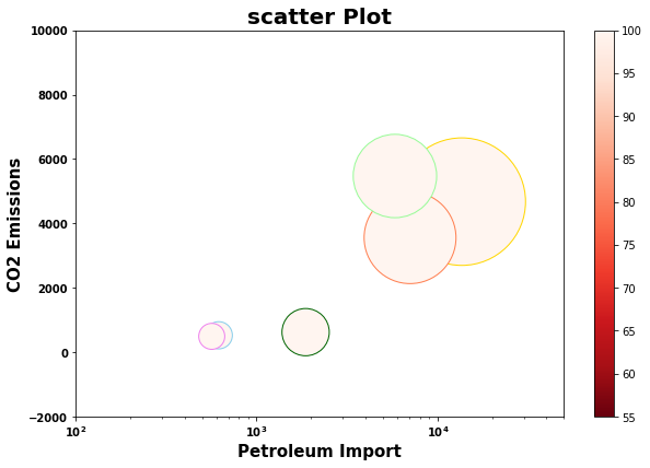
Interactive scatter Plot
def plotyear(year):
    bubble = data[data.Year == year]
    area = 1 * bubble['CO2 Emissions']
    colors = bubble.Geography.map({'Africa': 'blue','Europe': 'yellow','North America': 'violet','Asia': 'red','South America': 'green','Middle East': 'Indigo'})

    bubble.plot.scatter('Import','CO2 Emissions',
                      s=area,c=colors,
                      linewidths=1,edgecolors='K',
                      figsize=(10,8),label=colors)

    plt.axis(xmin=-1000,xmax=25000,ymin=-2000,ymax=25000)
    plt.xlabel('Petroleum Import ( barrels per day)',fontweight='bold',fontsize=15)
    plt.ylabel('CO2 Emissions', fontweight='bold',fontsize=15)
    Africa = mpatches.Patch(color='blue', label='Africa')
    Europe = mpatches.Patch(color='yellow', label='Europe')
    South_America = mpatches.Patch(color='green', label='South America')
    Asia = mpatches.Patch(color='red', label='Asia')
    North_America = mpatches.Patch(color='violet', label='North America')
    Middle_East = mpatches.Patch(color='Indigo', label='Middle East')
    plt.legend(loc = 2,handles=[Africa,Europe,South_America,Asia,North_America, Middle_East])
    plt.title('Interactive scatter Plot',fontweight="bold",fontsize = 20)
    plt.xticks(fontweight="bold",fontsize = 10)
    plt.yticks(fontweight="bold",fontsize = 10)
    plt.show()
interact(plotyear,year=widgets.IntSlider(min=1980,max=2015,step=1,value=1980))
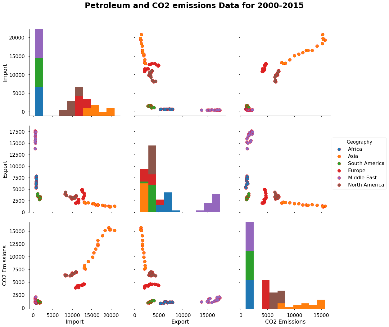
Scatter Matrix Plot
A scatter matrix is a pair-wise scatter plot of several variables presented in a matrix format. It can be used to determine whether the variables are correlated and whether the correlation is positive or negative
# Scatter Matrix

sns.set_context("poster")
cols = ['Import','Export','CO2 Emissions']
scatter_matrix = sns.pairplot(data[data['Year'] >= 2000],
             vars = cols,
             hue = 'Geography', diag_kind = 'hist',
             plot_kws = {'alpha': 1, 's': 100, 'edgecolor': 'r'},
             size = 5);

# Access the Figure
fig = scatter_matrix.fig
plt.subplots_adjust(top=0.9)
# Add a title to the Figure
fig.suptitle('Petroleum and CO2 emissions Data for 2000-2015', fontsize=25, fontweight = 'bold')
plt.show()
References :
- https://www.eia.gov/
- https://stackoverflow.com/
Comments