
This topic explains the basics of python for data ingestion, exploration, and visualization using basic plots.
Data ingestion
Python library is a collection of functions and methods that allows you to perform many actions without writing your code. To make use of the functions in a module, you’ll need to import the module with an import statement
# Import libraries for basic python operation

import numpy as np # for multi-dimensional arrays and matrices operations
import scipy.stats # for scientific computing and technical computing
import pandas as pd # data manipulation and analysis
import matplotlib # for plotting
import matplotlib.pyplot as plt
%matplotlib inline
# Read the csv file using pandas
data = pd.read_csv('petroleum.csv')
Download the petroleum.csv
# Display the basic table information
data.info()
<class 'pandas.core.frame.DataFrame'>
RangeIndex: 216 entries, 0 to 215
Data columns (total 5 columns):
Year             216 non-null int64
Geography        216 non-null object
Import           216 non-null float64
Export           216 non-null float64
CO2 Emissions    216 non-null float64
dtypes: float64(3), int64(1), object(1)
memory usage: 8.5+ KB
Display the sample data table information
# Display first 5 rows
data.head(5)
result:
| Year | Geography | Import | Export | CO2 Emissions | |
|---|---|---|---|---|---|
| 0 | 1980 | Africa | 618.184 | 5428.078 | 525.605046 |
| 1 | 1981 | Africa | 609.270 | 3964.097 | 519.408287 |
| 2 | 1982 | Africa | 557.209 | 3458.547 | 558.221545 |
| 3 | 1983 | Africa | 477.787 | 3394.148 | 586.002081 |
| 4 | 1984 | Africa | 507.619 | 3629.964 | 612.150112 |
Data Visualization
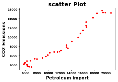
Scatter Plot
The Scatter Diagram graphs pairs of numerical data to look for a relationship between them.
plt.figure(figsize=(10,10))
data[data.Geography == 'Asia'].plot.scatter('Import','CO2 Emissions',c = 'red')
plt.xlabel('Petroleum import', fontweight="bold",fontsize=15)
plt.ylabel('CO2 Emissions', fontweight="bold",fontsize=15)
plt.title('scatter Plot',fontweight="bold",fontsize = 20)
plt.xticks(fontweight="bold",fontsize = 10)
plt.yticks(fontweight="bold",fontsize = 10)
plt.show()
Describe basic statistics summary of a feature or variable
data[data.Geography == 'Asia'].Import.describe()
result:
count       36.000000
mean     11928.644624
std       4830.261052
min       5710.417000
25%       7001.003250
50%      11717.250500
75%      16120.587750
max      20838.615000
Name: Import, dtype: float64
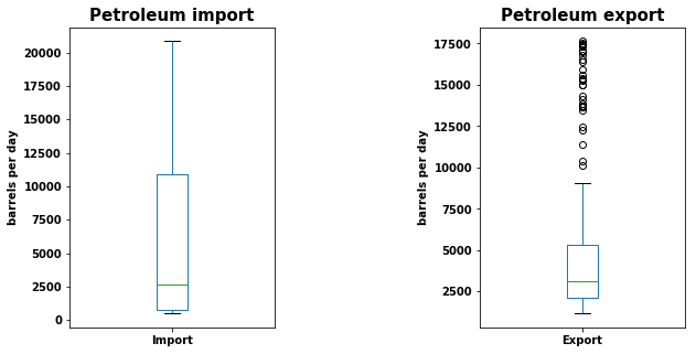
Box Plot
A Box and Whisker Plot (or Box Plot) is a convenient way of visually displaying groups of numerical data through their quartiles.
# Plot box plot to find out the outliers using a single feature or variable

plt.figure(figsize=(10,5))
plt.subplot(1,2,1);
data.Import.plot(kind='box')
plt.title('Petroleum import',fontweight = 'bold',fontsize = 15 )
plt.xticks(fontweight="bold",fontsize = 10)
plt.yticks(fontweight="bold",fontsize = 10)
plt.ylabel('barrels per day',fontweight="bold",fontsize = 10)

plt.subplot(1,2,2);
data.Export.plot(kind='box')
plt.title('Petroleum export',fontweight = 'bold',fontsize = 15 )
plt.xticks(fontweight="bold",fontsize = 10)
plt.yticks(fontweight="bold",fontsize = 10)
plt.ylabel('barrels per day',fontweight="bold",fontsize = 10)

plt.subplots_adjust(wspace=1)
plt.show()
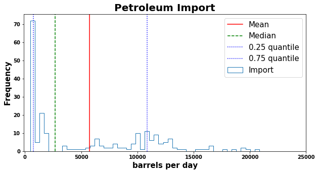
Histogram
A histogram is an accurate representation of the distribution of numerical data
# Plot histogram

plt.figure(figsize=(10,5))
data.Import.plot(kind='hist',histtype='step',bins=50)
plt.axvline(data.Import.mean(),c='red',label = 'Mean')
plt.axvline(data.Import.median(),c='green',linestyle='--',label = 'Median')
plt.axvline(data.Import.quantile(0.25),c='blue',linestyle=':',label = '0.25 quantile')
plt.axvline(data.Import.quantile(0.75),c='blue',linestyle=':',label = '0.75 quantile')
plt.axis(xmin=-100,xmax=25000)
plt.title('Petroleum Import',fontweight="bold",fontsize = 20)
plt.xlabel('barrels per day',fontweight="bold",fontsize = 15)
plt.ylabel('Frequency',fontweight="bold",fontsize = 15)
plt.xticks(fontweight="bold",fontsize = 10)
plt.yticks(fontweight="bold",fontsize = 10)
plt.legend(loc=1, prop={'size': 15})
plt.show()
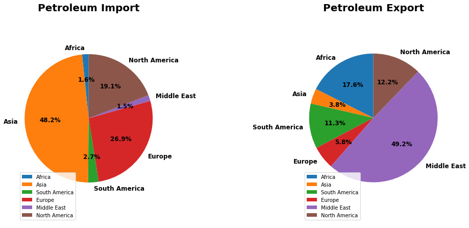
Pie chart
A pie chart is a circular statistical graphic, which is divided into slices to illustrate numerical proportion
plt.figure(figsize=(15,7.5))
plt.subplot(1,2,1);
data[data.Year == 2015].Import.plot(kind='pie',startangle=90,autopct='%1.1f%%',colors=['C0','C1','C2','C3','C4','C5'],labels = ['Africa', 'Asia', 'South America', 'Europe', 'Middle East',
       'North America'],textprops={'fontweight':'bold','fontsize': 12});
plt.legend(loc=3,fontsize=10)
plt.ylabel('')
plt.title('Petroleum Import',fontweight="bold",fontsize = 20)
plt.axis('equal')

plt.subplot(1,2,2);
data[data.Year == 2015].Export.plot(kind='pie',startangle=90,autopct='%1.1f%%',colors=['C0','C1','C2','C3','C4','C5'],labels = ['Africa', 'Asia', 'South America', 'Europe', 'Middle East',
       'North America'],textprops={'fontweight':'bold','fontsize': 12});
plt.legend(loc=3,fontsize=10)
plt.ylabel('')
plt.title('Petroleum Export',fontweight="bold",fontsize = 20)
plt.axis('equal')

plt.subplots_adjust(wspace=1)
plt.show()
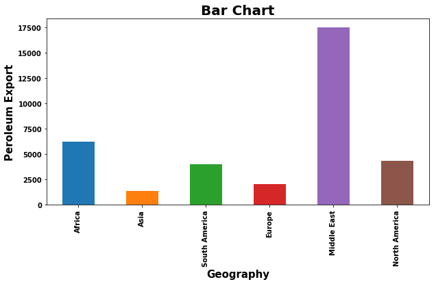
Bar chart
A bar chart or bar graph is a chart or graph that presents categorical data with rectangular bars with heights or lengths proportional to the values that they represent.
plt.figure(figsize=(10,5))
N = 6
ind = np.arange(N)    # the x locations for the groups
data[data.Year == 2015].Export.plot(kind='bar')
plt.title('Bar Chart',fontweight="bold",fontsize = 20)
plt.ylabel('Peroleum Export',fontweight="bold",fontsize = 15)
plt.xlabel('Geography',fontweight="bold",fontsize = 15)
plt.xticks(ind, ('Africa', 'Asia', 'South America', 'Europe', 'Middle East',
       'North America'),fontweight="bold",fontsize = 10)
plt.yticks(fontweight="bold",fontsize = 10)
plt.show()
References :
- https://www.eia.gov/
- https://stackoverflow.com/
Comments